
The planned vs Actual chart in excel will give you an edge over traditional tabular analysis. In fancy terms, we call it as a Budget vs Actual analysis or Variance analysis.
Indeed, it’s quite essential to assess the performance of our plans against actual results periodically. So, in this step by step tutorial, we are going to take a look at how to build planned vs actual graph in excel.
Steps to build Planned vs Actual Chart in Excel:
Step#1
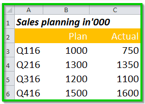
It all starts with the data, your data should be in a nice tabular format like the one I have below.
Step# 2
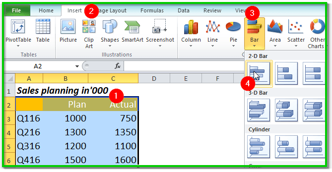
Select A2:C6 range → Insert → Bar Chart → Clustered 2D bar chart
Step#3
Remove unnecessary grid lines to have a white space around the graph.
Step #4
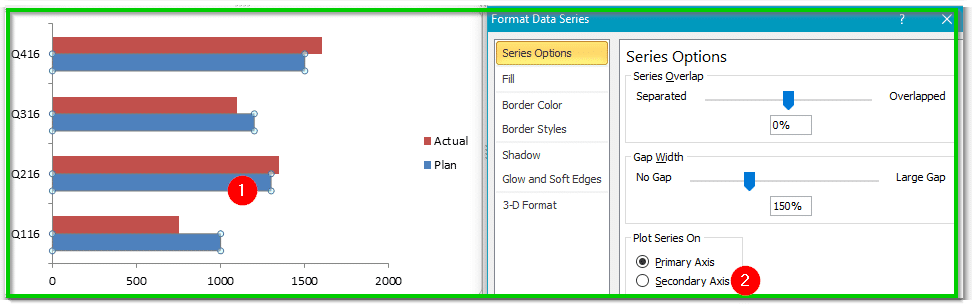
Right click on ‘Plan’ bar and click on ‘Format data series’ and then select Secondary access from the dialogue window.
Step #5
Select actual bar → Right Click → Format data series → On the ‘Gap Width’ select 106% → Change fill colour according to your requirement.
Step #6
Now select ‘Plan bar’ → Right Click → Format data series → On the ‘Gap Width’ make it 314% →Change fill colour according to your requirement.
Also read: How to visualize your data with the help of excel heatmap
Step #7
Select secondary horizontal axis from the top and remove axis scale, you may also want to remove the border from the Graph to increase white space.
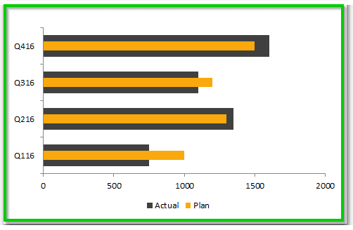
So, after all the adjustments planned vs actual graph should look like this.
The narrative behind Excel chart Goal vs Actual:
Building Target vs Actual chart in excel is one step closer to storytelling, but it’ll quickly become useless unless it relates to your story.
As you can see, in our above graph Orange colour represents ‘Plan’ and ‘Gray’ represents ‘Actual’. If you look at Q116 we were not able to achieve what we had planned.
Similarly, in Q416 we had overachieved to our planned number.
Also read: 12 Excel skills that are in demand
Conclusion:
Storytelling can be easier and attractive with the help of visualization, especially when presenting budget vs actual numbers during business updates meeting.
If you choose to present data in a tabular format, I guess there is a high chance that your reviewer will get bored.
Instead, you may present data in a structured way with the help of some visual effects to yield better results.
Consider our Planned vs Actual chart in excel tutorial as a base and try to create your own charts. It’s relatively simple and effective.
There is an excellent tutorial on HBR about how to tell a story with the help of data.
Have you tried anything similar to the above? if so why not share your success story with us in the comments section below.